MATLAB: how to draw a great heatmap?
Drawing heat maps, which represent matrix data using colors, in MATLAB is fairy simple, but there is a bit of confusion about it. It’s mainly because it’s easier to find quiet unintuitive Bioinformatics Toolbox’s HeatMap object than the standard way of doing it which is imagesc(matrix) supported with colormap(scheme).
If you only need code snippet, here it is:
|
1 2 3 4 |
A = 1:50; % matrix to draw colormap('hot'); % set colormap imagesc(A); % draw image and scale colormap to values range colorbar; % show color scale |
For the list of all colormaps available by default, see MathWorks’ documentation on colormap. In this article below, I’ll try to explain which one I would choose in most cases and why.
Why default colormap is not good?
Some time ago I was working with thermal images of a palm. Data was actually the temperature, so heatmaps seem to be the best way to represent it 😉 Using image and imagesc I made pretty images that appeared good on my screen, but then following issues arose:
- How would it look printed in black & white and on my Kindle?
- How would it look to those 7-8% males color vision deficiency?
- How will it look on this 10-years-old projector where I need to present my results?
- How will it look to my dog (kidding, but it’s an interesting question too)
Well, first three are quite easy to check. Few standard colormaps converted to grayscale are displayed in figure 1, below. For simulation of how users with various color vision deficiencies, see this interesting diagram by Vlad Atanasiu (I couldn’t confirm it, but I believe it has some solid foundations). Projector didn’t make much problems in my case, but it’s woth to check if it has enough contrast to see all important color differences.
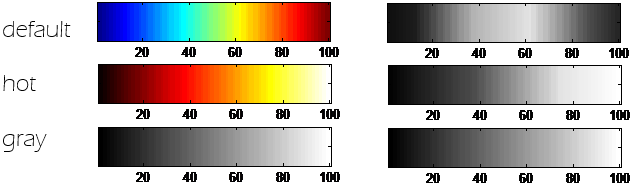
As we can see here, the ‘default’ (or ‘jet’) colormap, in grayscale turns differently than we might expect. The highest values are not the brightest, so the information on the picture will just look wrong!
To scale or not to scale?
It might be a cliché, but this might be the good place to bring up the difference between image and imagesc.
- image(X)
- if drawing 2D array (MxN), by default the data will be directly mapped to colormap colors (with values 1…64), or the closest color available in the colormap
- imagesc(X)
- if drawing 2D array (MxN), data will be first scaled to the full colormap range and just then drawn
So the codes image(1:256) and imagesc(1:256) will render different results, as shown in figure 2.
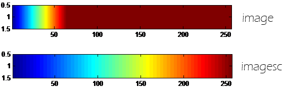
Be aware that when you scale the colormap to image, images will not be easily comparable for people, and sometimes might be misleading.
Which color is warmer?
Going deeper into «which colormap is best» we need to make the decision whether some color A is warmer than color B. And it is actually not so simple. I was hoping that reading about color theory would give me a clue, but now I think such strict definition may not be possible.
Generally, in color theory warm colors are those associated with daylight and sunset or fire, while cool colors have their peak somewhere blue. This is the way the term warm color and cool color are used in paintings etc. Also, not only hue makes color cold or warm, but also its saturation or intensity. And contrast, as people really perceive color differences than colors itself.
We also have a physical measure color temperature. The problem is that the higher temperatures are blue there, while lower go towards red hues, so it’s just not how we intuitively perceive what is warmer.
The colors are not a simple thing and I’m not an expert, so I’ll just end this section with conclusion that the question «Which color is warmer?» is not an easy one.
Lessons learned
Below there are two heatmaps i generated for my thermal hand recognition project. The default colormap (on the right) seems to look good on the screen, but the one on the left actually represents the data better.
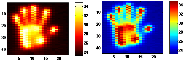
So now here is the conclusion. If you draw a heatmap with a plain range of values, think whether the 'gray' colorscale woudn’t be enough. It will work fine no matter if it’s on the screen, paper, or e-ink display, and should be read without problems by people with some form of color impairment. If you want color, go for 'hot' colormap rather than using default ‘jet’. ‘Hot’ isn’t actually worse than grayscale. Be careful when scaling colormaps. And, what is most important, make sure the figure presents the data in a way that is easy to understand and is well described 😉
(You would probably also not want this comic to be about you)
Thanks for this post. After wasting a couple of hours customizing the heatmap function, I landed on this post of yours. This way of doing heatmaps is a lot more flexible and easier. Thanks once again!
I’m glad that code snippet helped 🙂 HeatMap is probably a powerful object to work with, but also not what I was expecting to find when drawing my heatmap.
hey, do you know, how to smooth heat map, I have only 32×24 measuring points, so it doesn’t look too attractive.
In Matlab you could use interpolation eg. by resizing your matrix to a larger one before drawing, like:
scale = 16;
imgMatrix = imresize(imgMatrix, size(imgMatrix)*scale);
The effect would be like on https://dotnetbattlefield.taurit.pl/tmp/imresize.jpg image. The other idea is to use some blur effect outside of MATLAB, resulting with something like https://dotnetbattlefield.taurit.pl/tmp/heatmap_blur.png
But in general I would not do it at all, as it looks like creating data you don’t really have, which might be misleading (as you don’t know hou would the data look in higher resolution) 😉
I’m working very first time with heat map. So kind of confused what to do. Can you please provide a little more explanation on how did you do the heat map with the hand shape? I have a matrix of points X,Y which is actually the pixels of a given image. I want to generate the heat map on that image with the matrix I have. Is it even doable? I apologize if I ask naive question. Please help
Hey, you need to transform your list of points into a matrix first. The easiest way seems accumarray() function. Here’s how it works: https://dotnetbattlefield.taurit.pl/tmp/convert_list_of_points_to_matrix.png – I hope this quick draft helps. There are no naive questions, I used to do the same thing in much more complicated way and now I found this useful function thanks to your question 😉
The hand shape itself is actually a data obtained from a device we use in lab, so It’s not a standard MATLAB resource.
Hi,
I have problem with the heatmap. I have a list of coordinates(x,y),e.g (51,51),(101,51)..and so on. Each coordinate will have its own interaction force, e.g 10.4,15 and etc..Do I have to transform all the coordinates into matrix first before apply the code snippet as shown above? I’m glad if you show me an example regarding to this.
Million thanks in advance.
Hey, see my answer to Pow’s comment. From what I understand, you have similar data structure as he was dealing with. See if this explanation: https://dotnetbattlefield.taurit.pl/tmp/convert_list_of_points_to_matrix.png is helpful to you. Greetings 🙂
I I have data which has two columns and about 10000 rows. For making a heatmap for the same, how do I assign the values of my matrix to A?
Hello,
This is amazing! Anyway, the color gradient can be smoothed out a bit? Like we have a smooth function for normal plots in MATLAB?
– Souradeep
In one of the previous comments you can find example approach to smoothing: https://dotnetbattlefield.taurit.pl/matlab-heatmap-colormap/#comment-47
If you use pcolor() you may use command “shading interp” to somewhat smooth it out. Sometimes it distorts the data, so default “shading flat” may be more appropriate on these cases.